White Screen of Death error in WordPress
One of the most common and frustrating problems faced by WordPress users is the White Screen of Death (WSOD).

What is a responsive site? It is said to websites that aim to display the page optimally on a wide range of different devices.
What is a responsive site ? It is said to websites that aim to display the page optimally on a wide range of different devices.
Responsive web design is a web design method that aims to display the page optimally on smart phones, tablets, and desktop computers .
A website designed with responsive HTML codes is compatible with flexible layers, floating layouts, flexible images and CSS media queries.
The concept of a responsive site (flexible grids) is that we use relative units such as percentages for the size of page elements instead of absolute units such as pixels or points. The size of flexible images is also determined with relative units so that they are not displayed outside of their display element. Media Queries allow different CSS to be applied to a page based on the characteristics of the viewing device (usually based on the width of the web browser).
With the increasing importance of smartphones and tablets and their close relationship with humans, the role of responsive design is becoming more important day by day. Responsive or reactive design allows the viewer to view the desired site or store well on different devices with different resolutions.
Sites and stores that use responsive design can receive more visitors through smartphones and tablets, and users can easily communicate with that website.
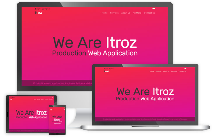
For example, Itros Digital Agency website is a responsive website, and when you enter it through a computer or laptop, its appearance is adjusted according to the resolution of your screen, and when you open the website on a smartphone or tablet, all the page specifications are The dimensions of your device are adjusted and in this way you can easily read the contents or view the images.
Websites that are not responsive have very small and unreadable texts when they are opened on mobile phones, and the framing is not correct and user-friendly.
In order to understand how a responsive site is different from a normal site, it is better to enter the following two sites in your smartphone browser and check the result.
Sports three and itros
Source" Itroz Academy
One of the most common and frustrating problems faced by WordPress users is the White Screen of Death (WSOD).
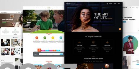
In this article, I will introduce the best WordPress theme design giants for launching Persian sites, or in other words, the right-clickable ones. These te

We are with you with the video of the sixth training session of the WooCommerce management panel from the WooCommerce online store management panel trainin
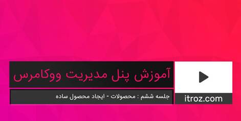
We are with you with the video of the sixth training session of the WooCommerce management panel from the WooCommerce online store management panel trainin

How to create an image with artificial intelligence (AI) has become a household word in recent years, with applications ranging from self-driving cars to

One of the most common and frustrating problems faced by WordPress users is the White Screen of Death (WSOD).

In this article, you will get to know the concept of inbound marketing, which is one of the most important things in website marketing. Be with Itroz Acade

To start a business on Instagram, you should pay attention to 8 key points. These 8 are the cornerstones of business on Instagram. Below is a description

Comments (0)